Professional Work / Spring 2016
Advanced mPOS Application
ROAMpay™ X5
Project Overview
BACKGROUND: ROAMpay™ X5 is the latest mobile payment solution from Ingenico Group. It is a mobile point of sale application for mobile smartphones and tablets. Developed from the ground up, ROAMpay™ X5 is designed to meet the needs of today’s merchants. Features include native support for today’s leading smartphones and tablets, a seamless, speedy, and secure checkout experience, and quick and easy access to all of the information merchants need.
PROBLEM STATEMENT: The current version of ROAMpay is beginning to look and feel outdated. Our mPOS solution could use a modern redesign. A new version should focus on delivering a more simplified, flexible, and seamless experience while still offering our previous robust features and innovations. The updated app should also include a new business offering of a white-label option. Furthermore, with the increased rate of adoption of tablets, the app should be optimized to take advantage of the extra screen real estate and portability of a tablet.
REQUIRED GOALS: Success should be measured by achieving the following payoff:
- Create a new experience with a focus on simplicity, flexibility, and efficiency.
- Align the ROAMpay X5 visual design with Ingenico Group’s branding and style guidelines.
- The redesigned user interface must include truly native tablet experience and familiar look and feel that increases merchant adoption, and improves customer satisfaction.
- The design must include a turnkey white-label option for providing faster speed-to-market.
- The white-label process should be easily communicable to customers.
- The white-label process should be easily streamlined in the development process.
User Research
For this project I relied on a Lean UX process. User research was based on past and present assumptions about our users. The process was to design a solution to the problem statement, measure any feedback, and then iterate the design based on this feedback.
To start, this process meant answering basic questions such as:
- Who are our current users?
- Who are our future users?
- What is this products main purpose?
- What situations is it used in?
- What key features will be improved?
- What will be the most important functionality?
- What’s the biggest risk to product delivery?
Initially, user data was provided by PM’s who worked directly with our customers. Preceding quantitative user data was available through metrics captured from our previous version. PM’s and key stakeholders formulated business and user requirements which informed my overall design.
USER PERSONA: A combination of qualitative and quantitative user data led to the creation of unique user personas. User personas were used to inform the overall design and to create user stories that got us from point ‘A’ to point ‘B’ to meet specific user goals.
For Ingenico Group’s RPX5, our primary user persona was our ideal target customer: a direct selling consultant. Using this user persona to tell the story helps build the right experience for the right customers.
User Persona: Michelle, 42
Industry: Direct Selling Jewelry
Employer: Stella & Dot
Title: Independent Sales Consultant
Wants:
- A pleasant checkout experience.
- An easy to understand interface.
- An increase in average sales.
- Shortened customer checkout time.
Motivations:
- Customer Satisfaction
- Making a Sale
- Meeting goals
- Efficiency
Frustrations:
- Long, complex checkout process.
- Tedious, redundant input fields during checkout.
- Inefficient UI layout.
- Having to take more steps than necessary to make a sale.
- Threats to customer satisfaction.
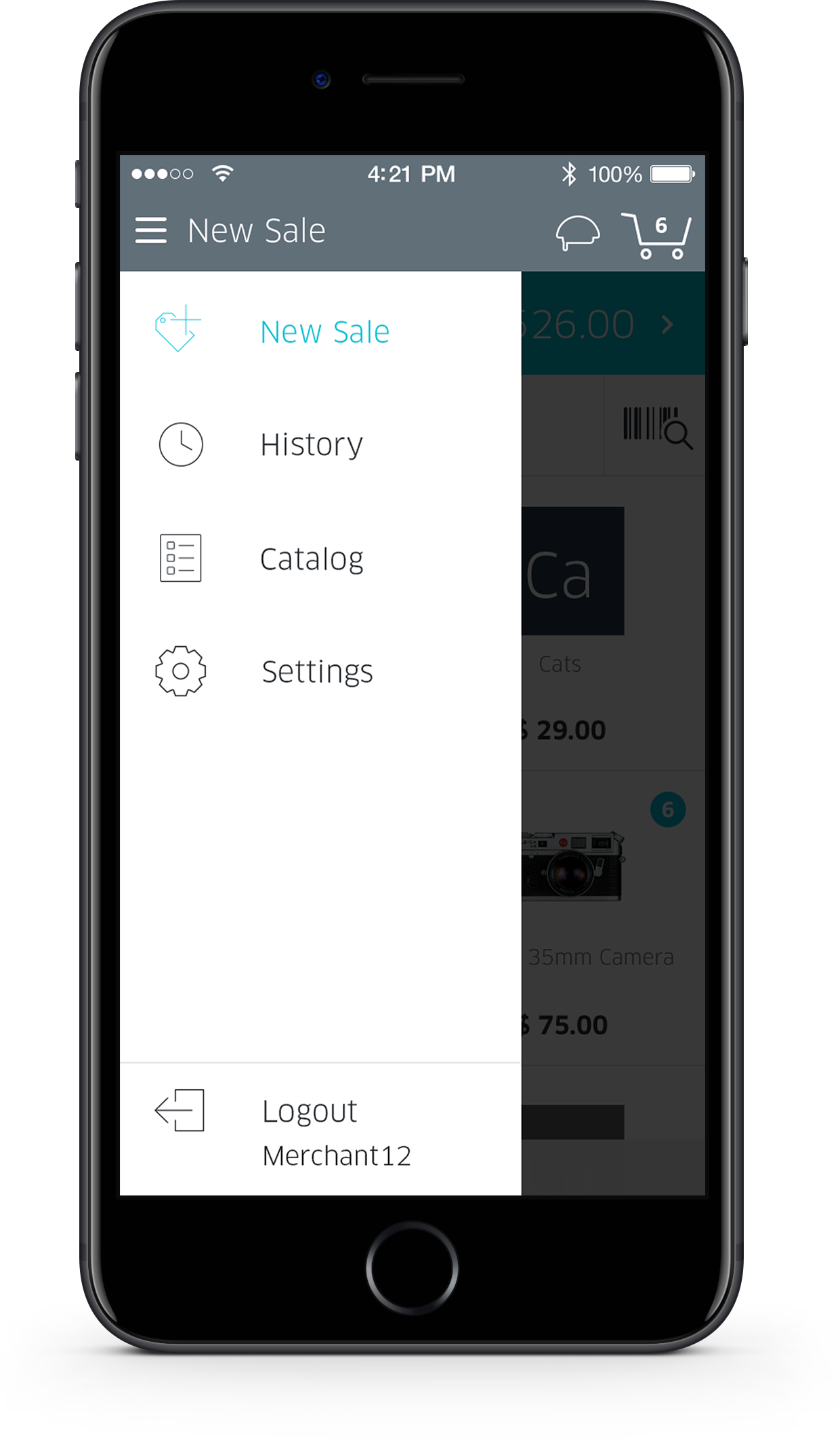
Ideation
Once user and business goals were formalized, it was time to start ideating. With a foundation in place, we could now start telling the story. From concept to implementation, I used a standard UI/UX process including brainstorming, wireframing, flow charts, interactive prototypes, and lo and hi-fidelity mockups.
The wireframing process spanned multiple screens and included various layouts and conceptual features. My goal was to minimize extra steps and maintain an efficient, straightforward experience.
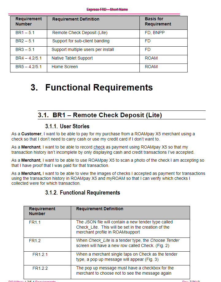
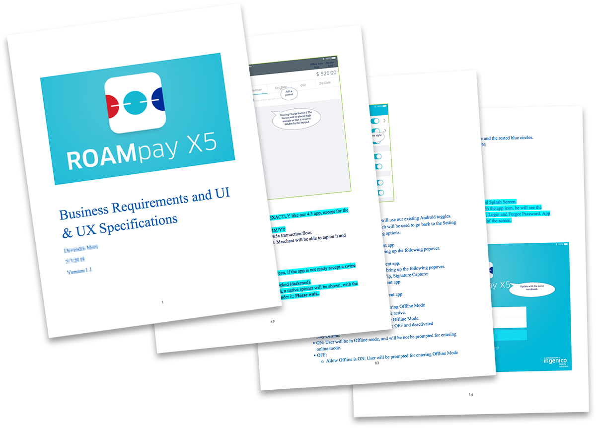
Example of an RPX5 requirement and user story.
Example of the Business Requirement Document from Product
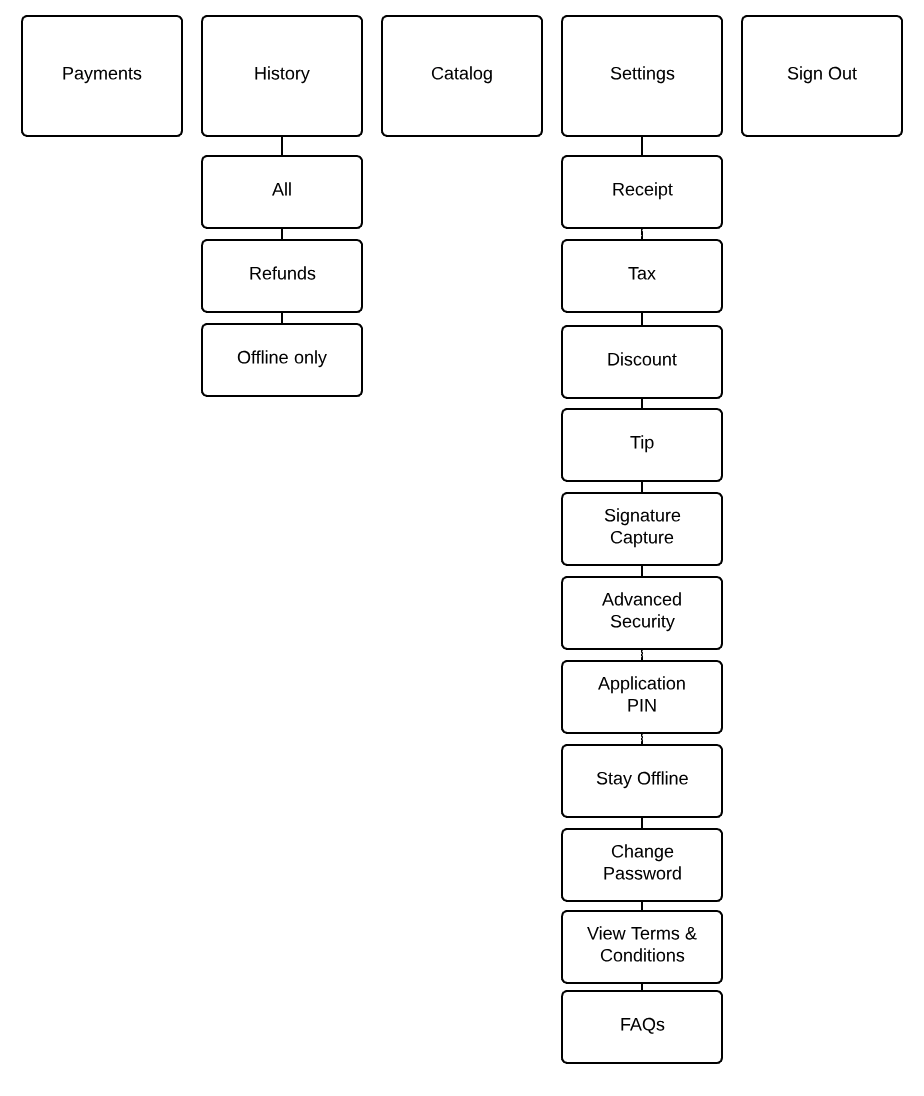
Early RPX5 screen flow to show hierarchy.
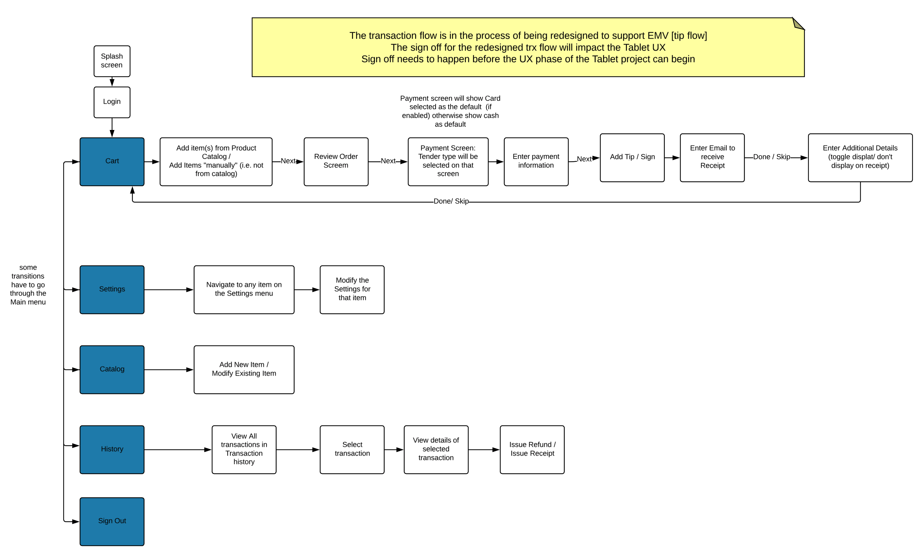
An early user flow example for our merchant persona.
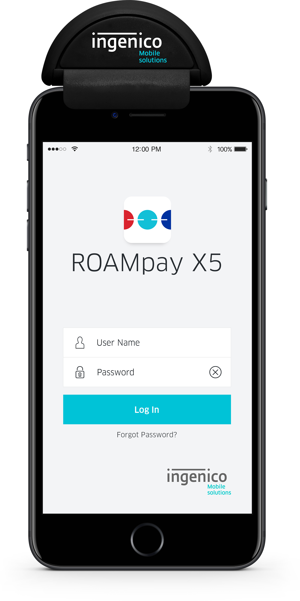
Visual Design
The following images display a range of visual designs and experiences during various design stages of RPX5. Some are the current designs and some are concepts.
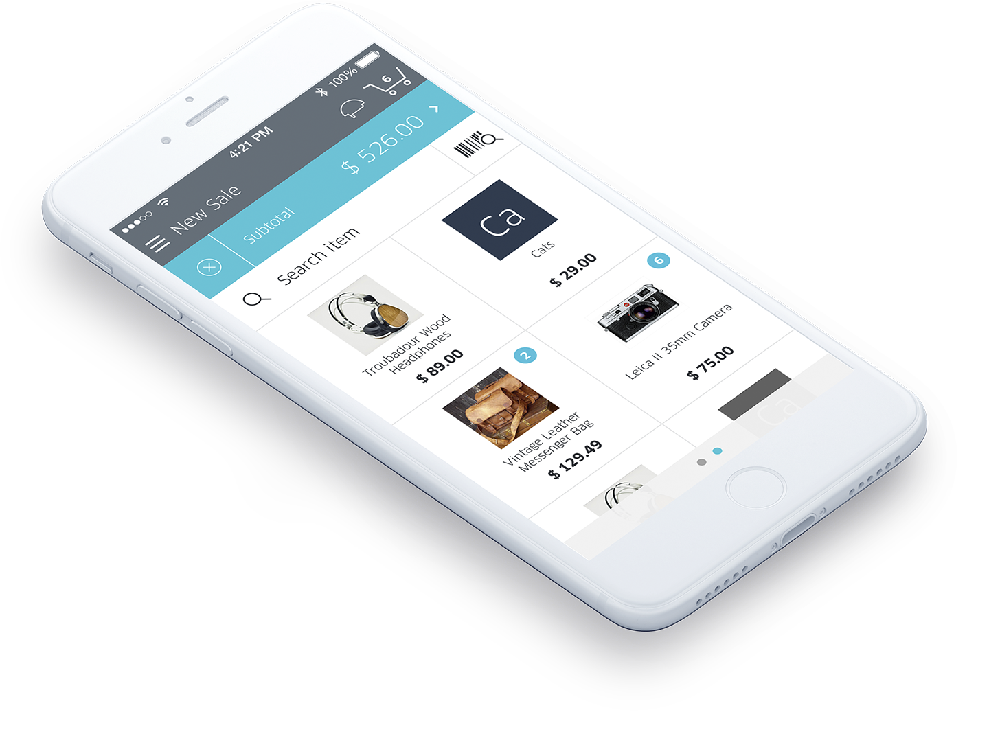
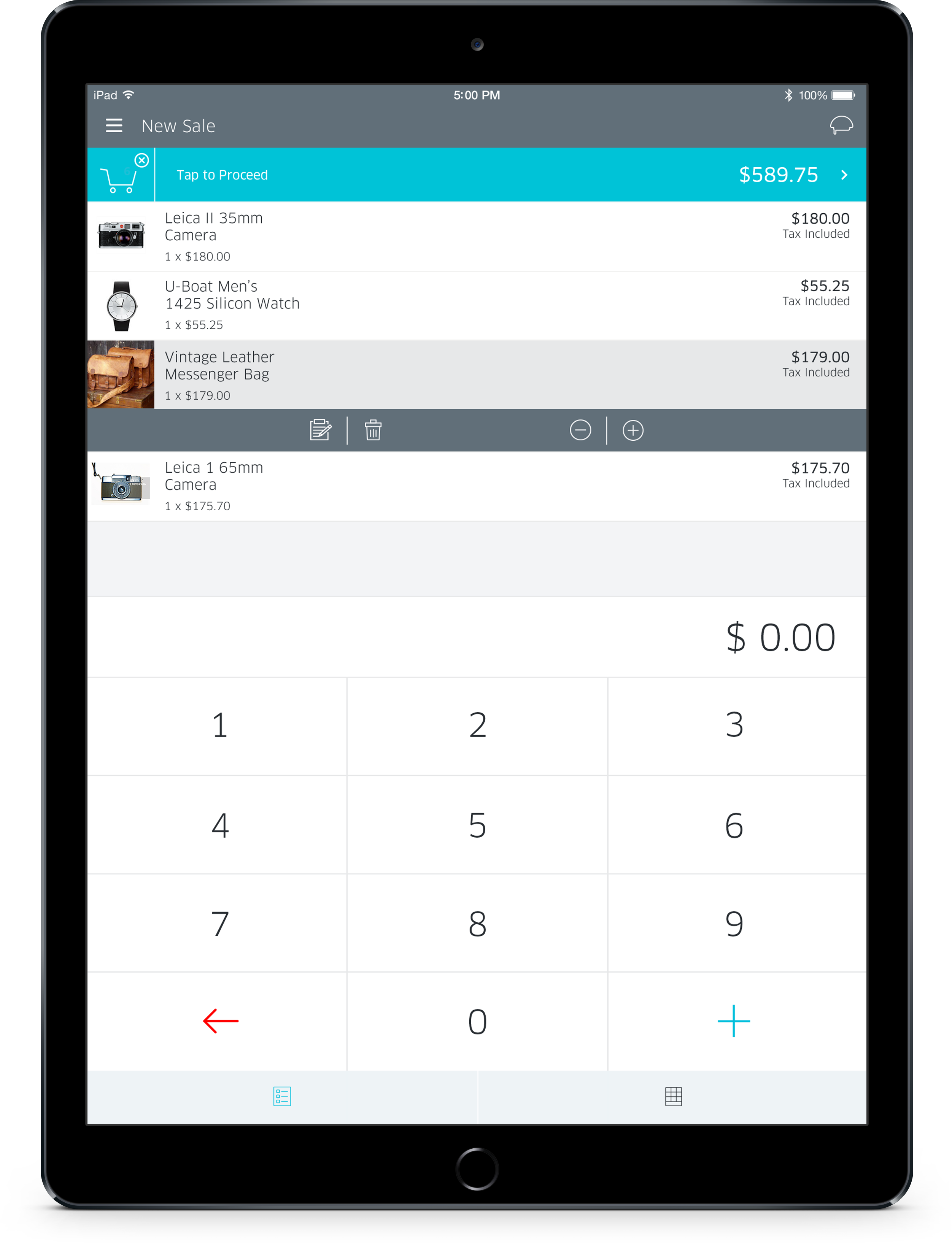
The UI aims to be simple, predictable, and efficient. It was designed to work on multiple platforms, including native Apple and Android support, as well as smartphone and tablet (in both portrait and landscape modes). The overall goal was a faster, more efficient purpose-driven check-out experience.
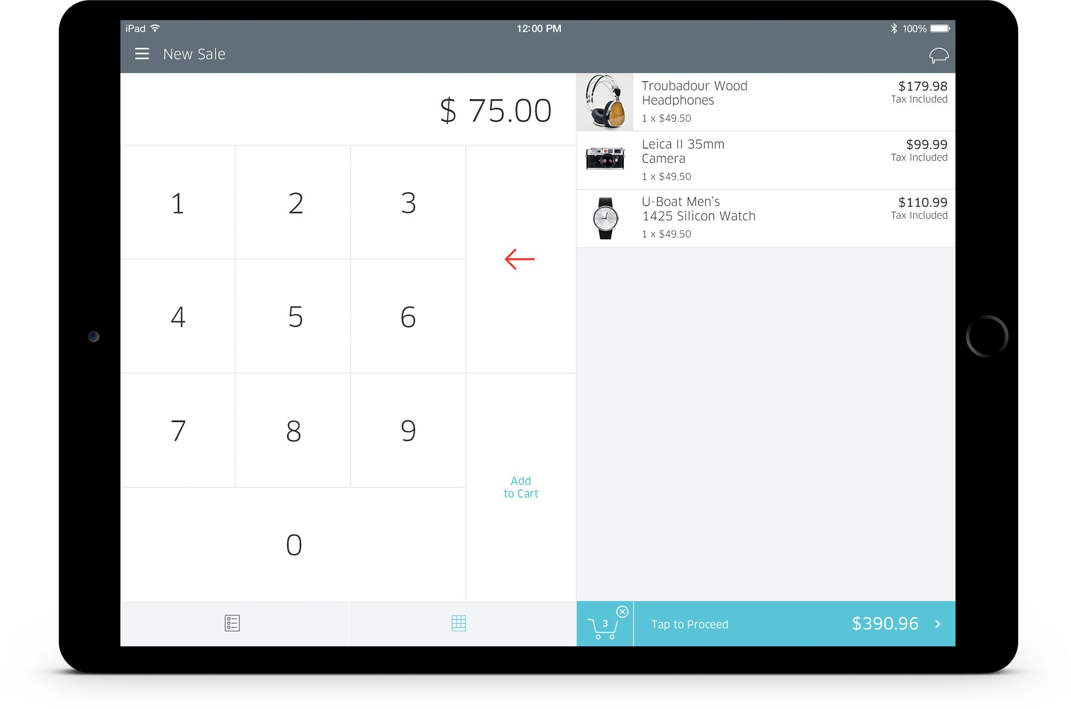
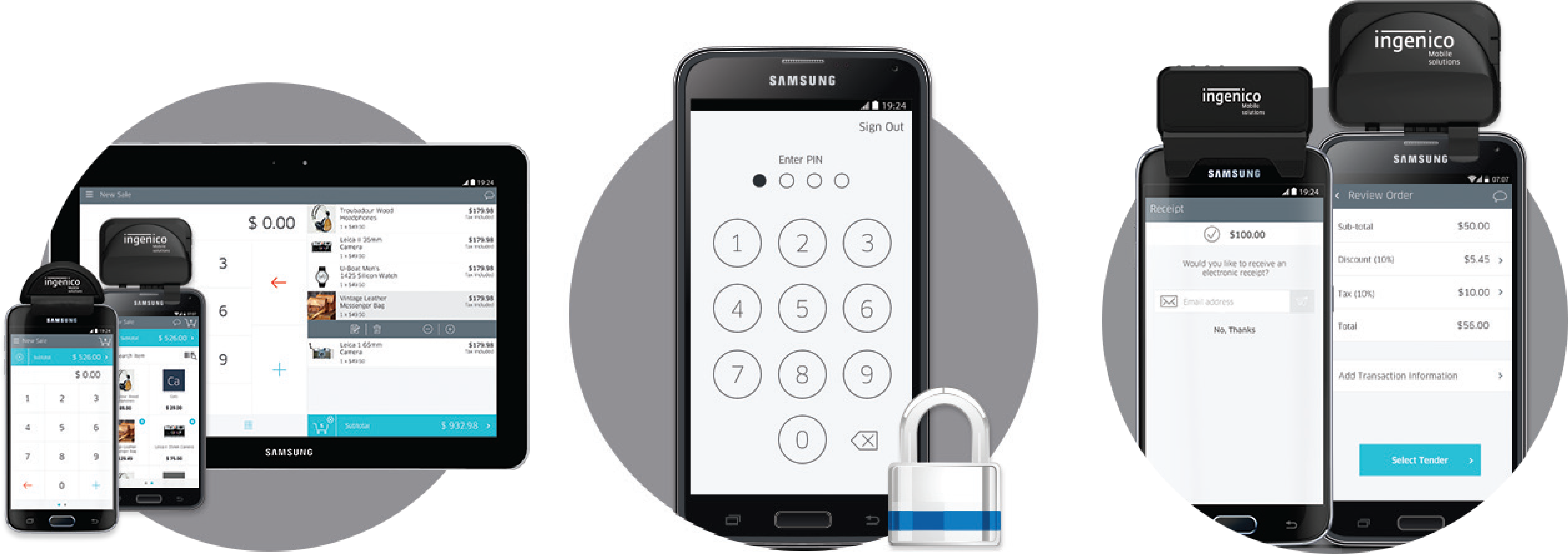
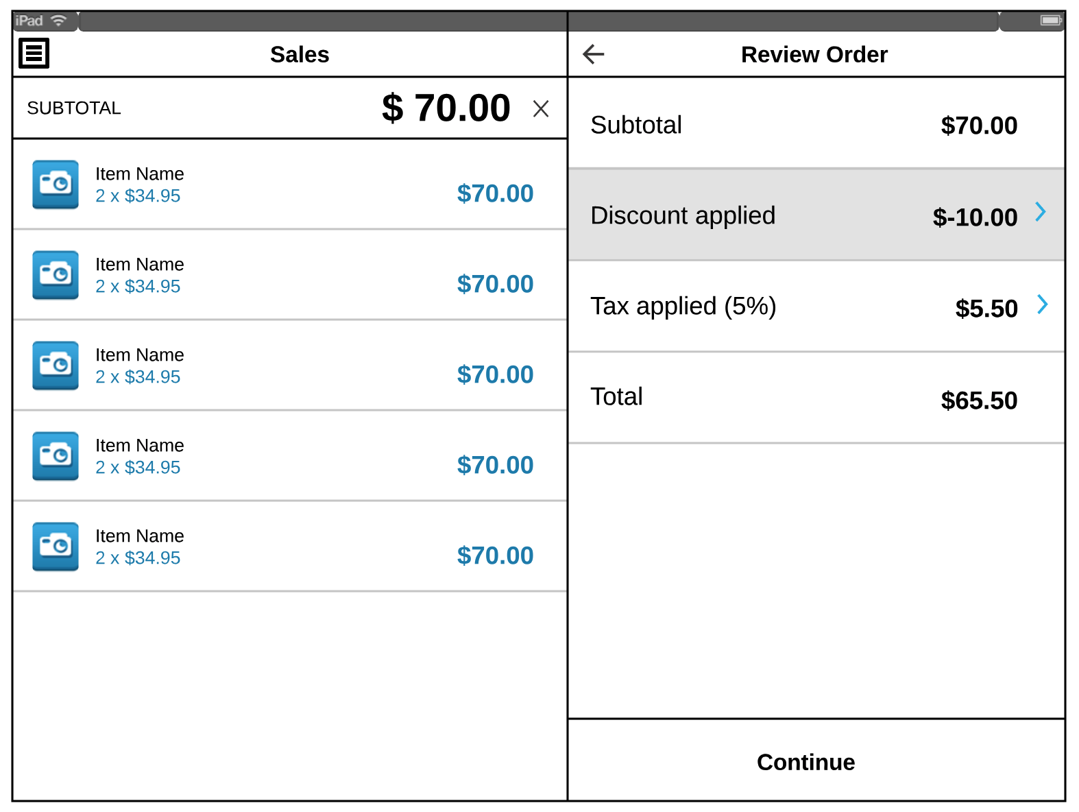
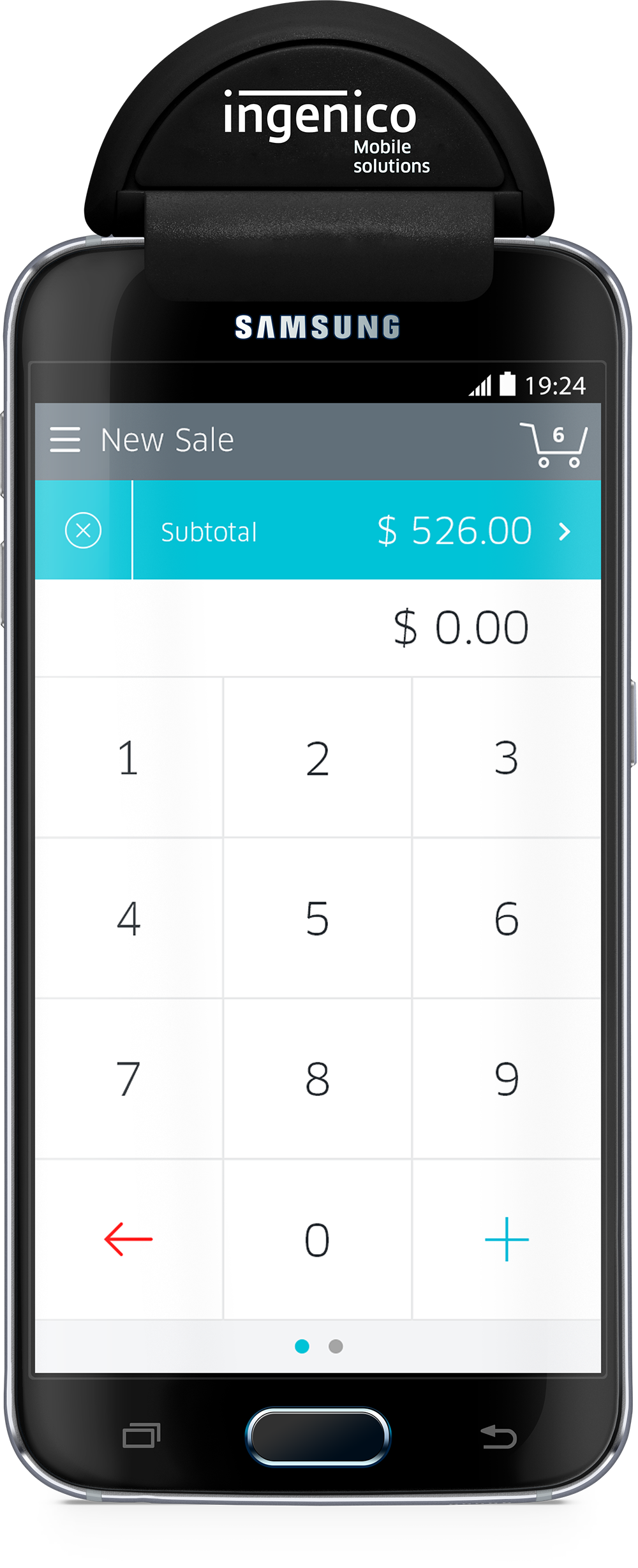
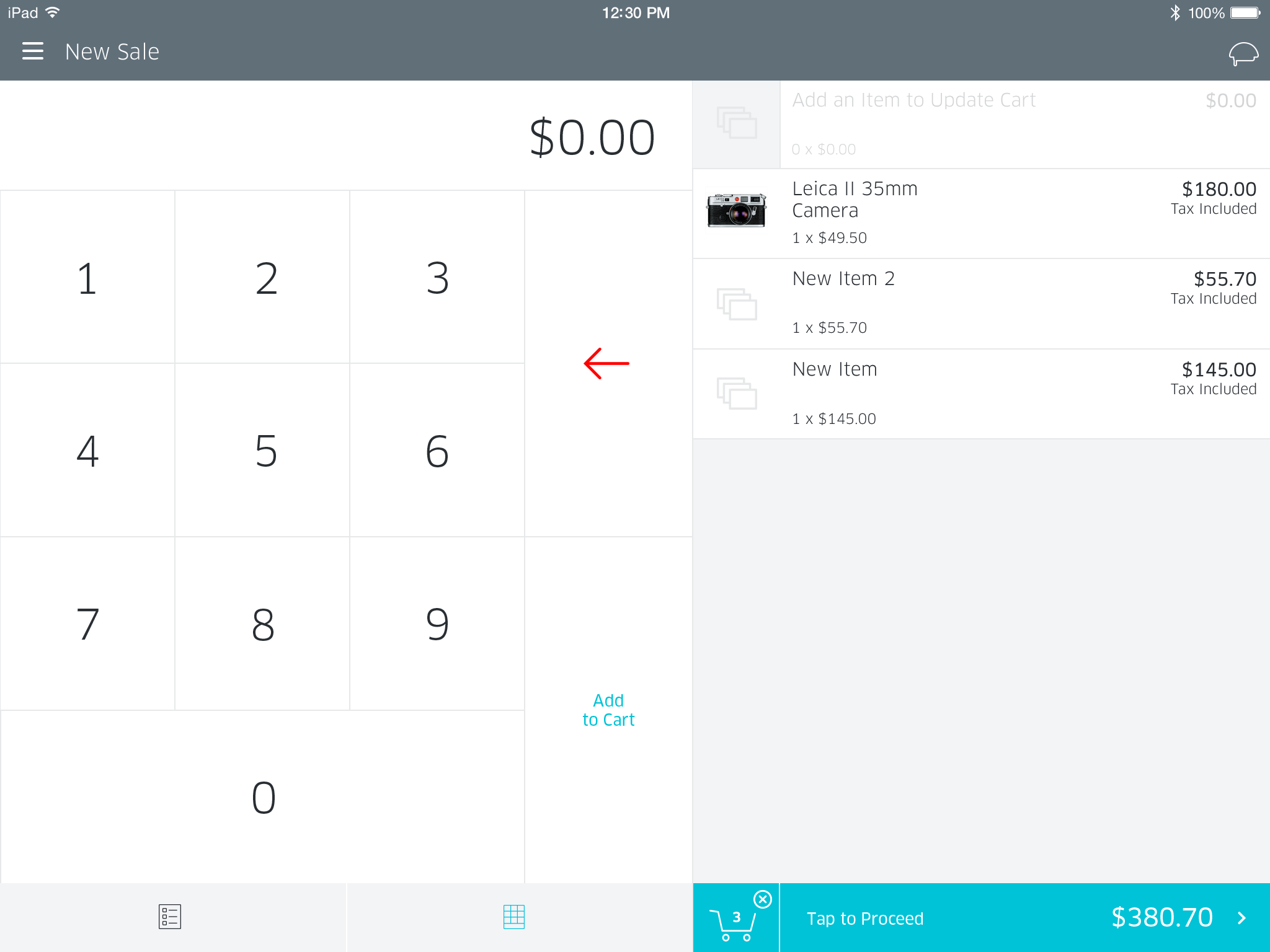
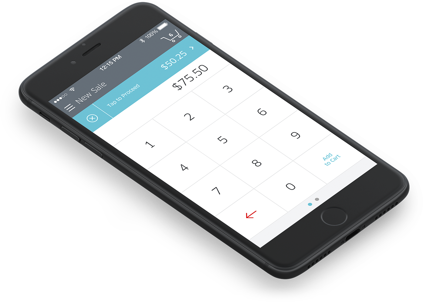
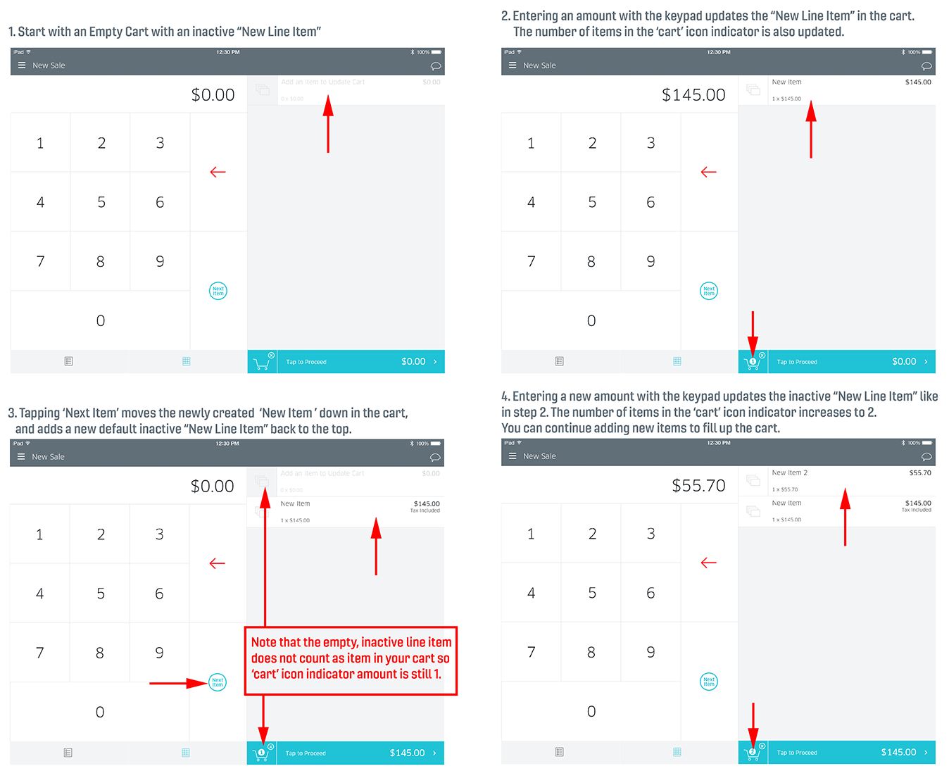
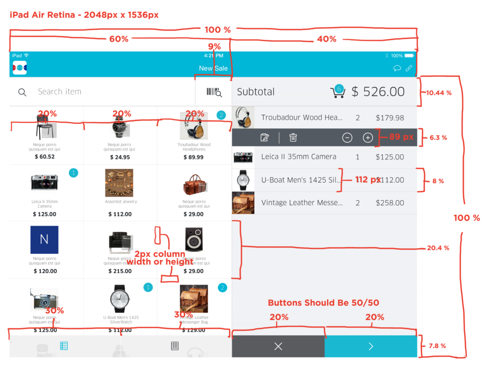
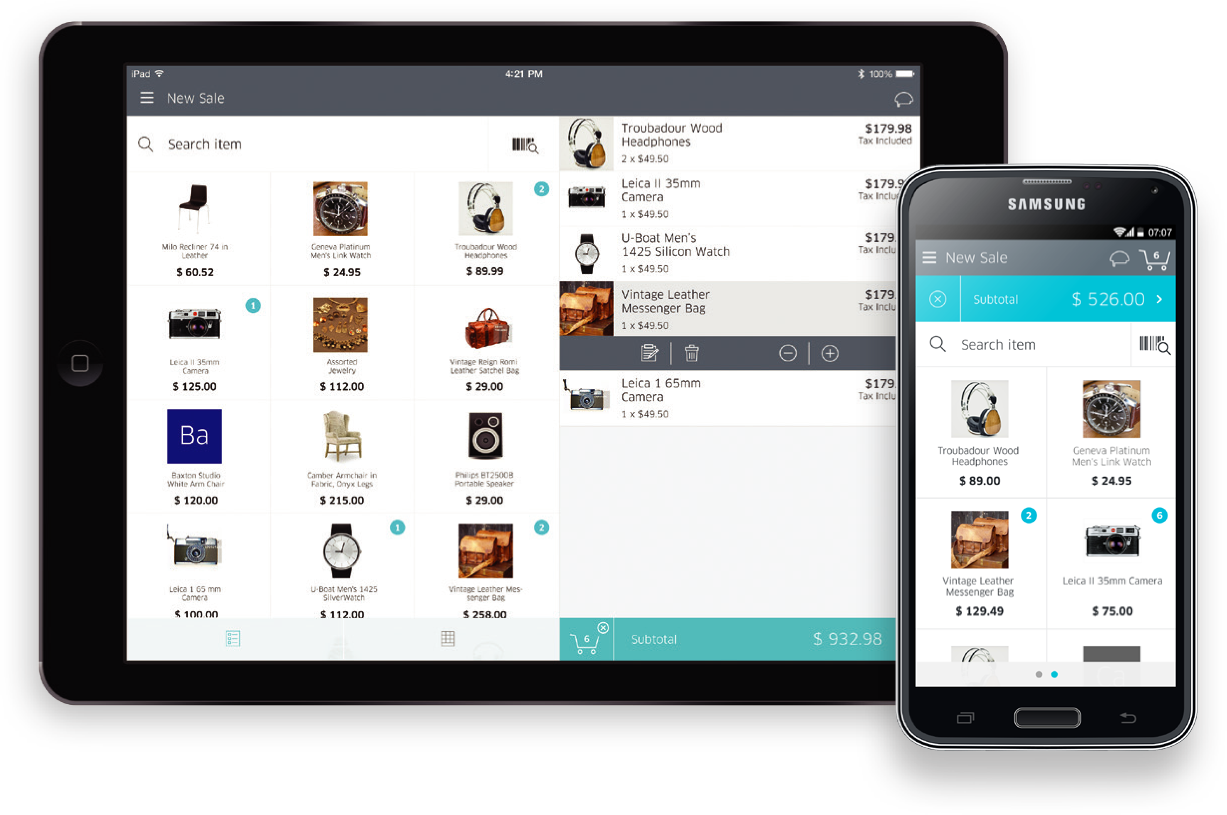
The keypad and cart view on a tablet.
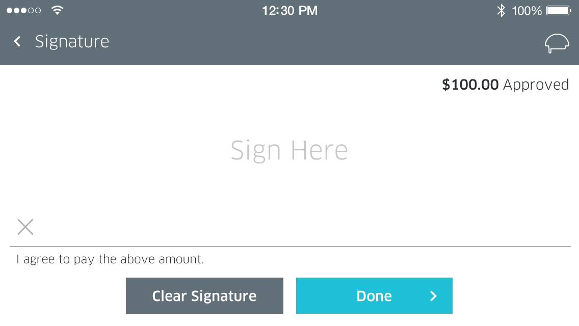
Landscape smartphone mockup with a large customer facing signature area .
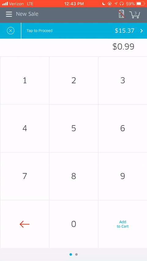
The keypad on an Android phone with one of our mPOS card readers attached.
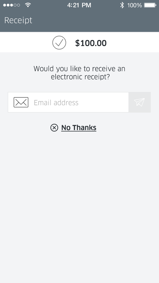
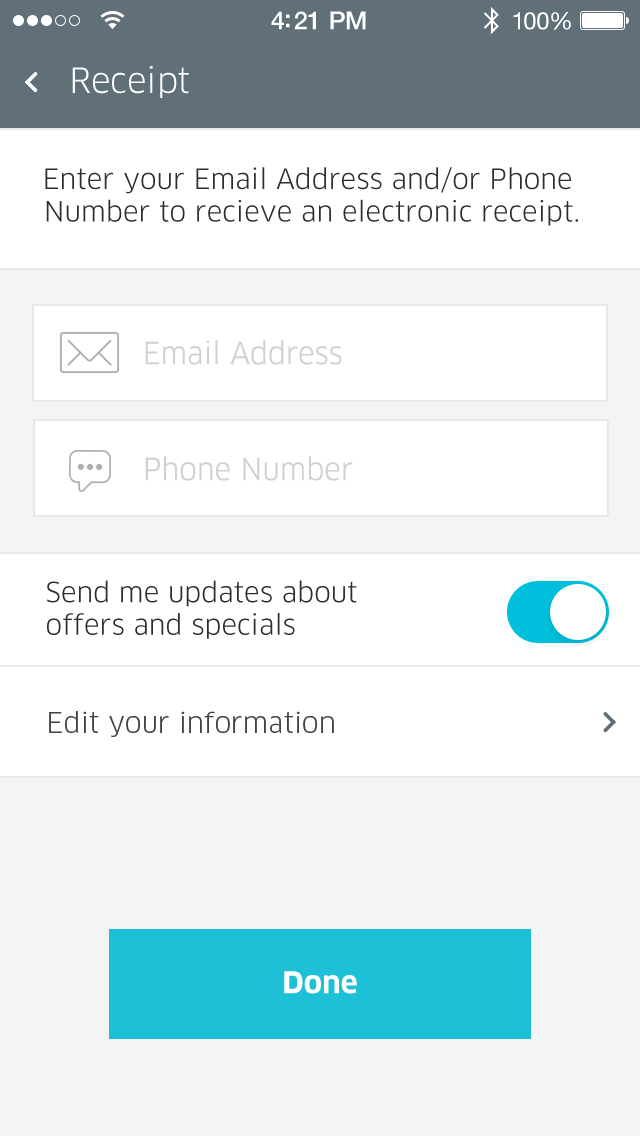
Customer receipt options
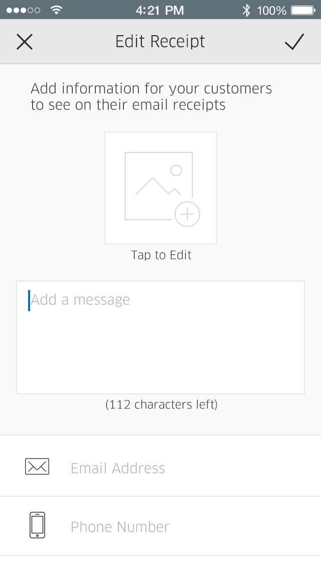
Editing your custom business receipt.
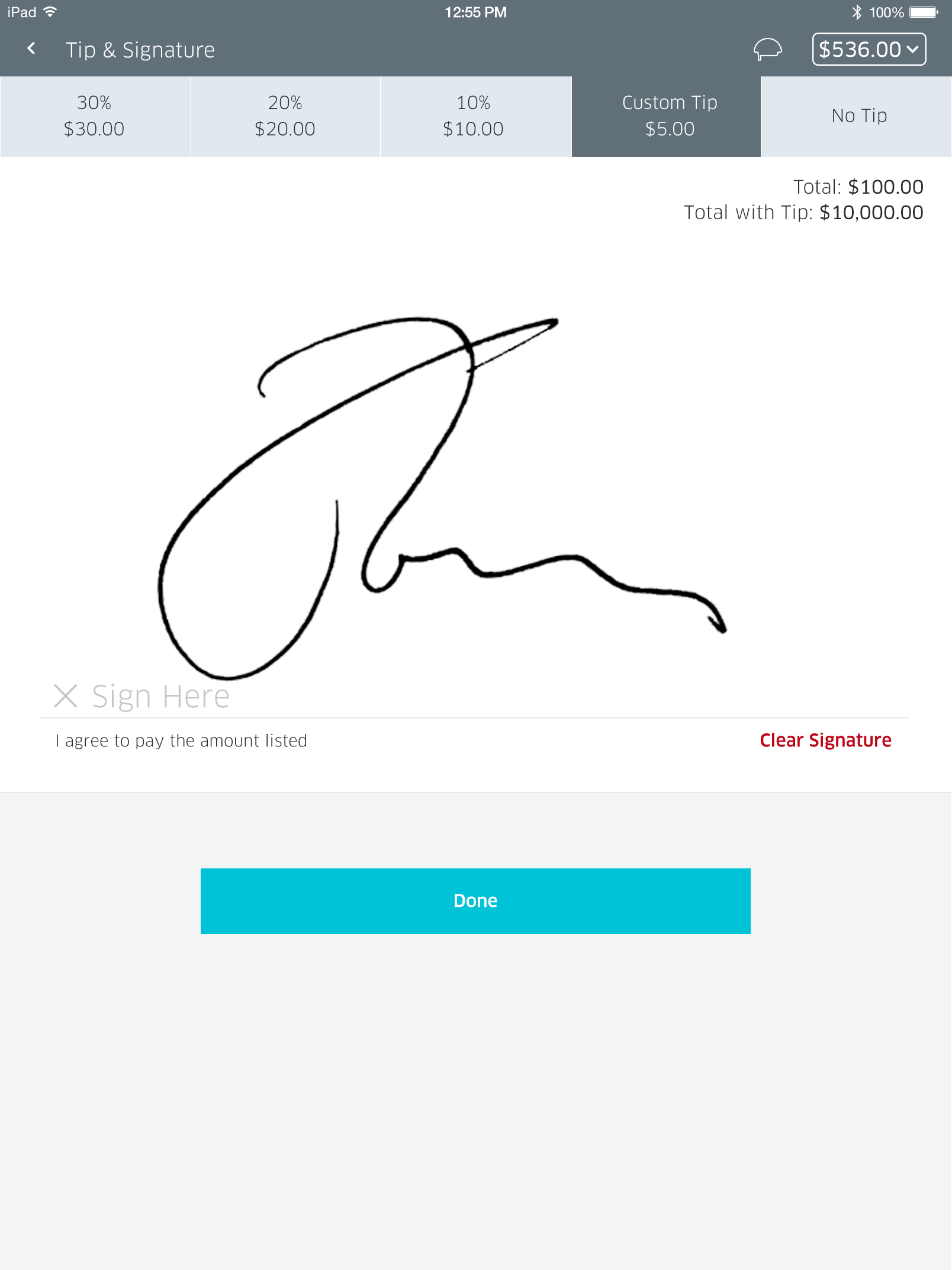
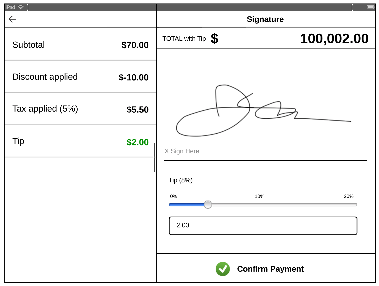
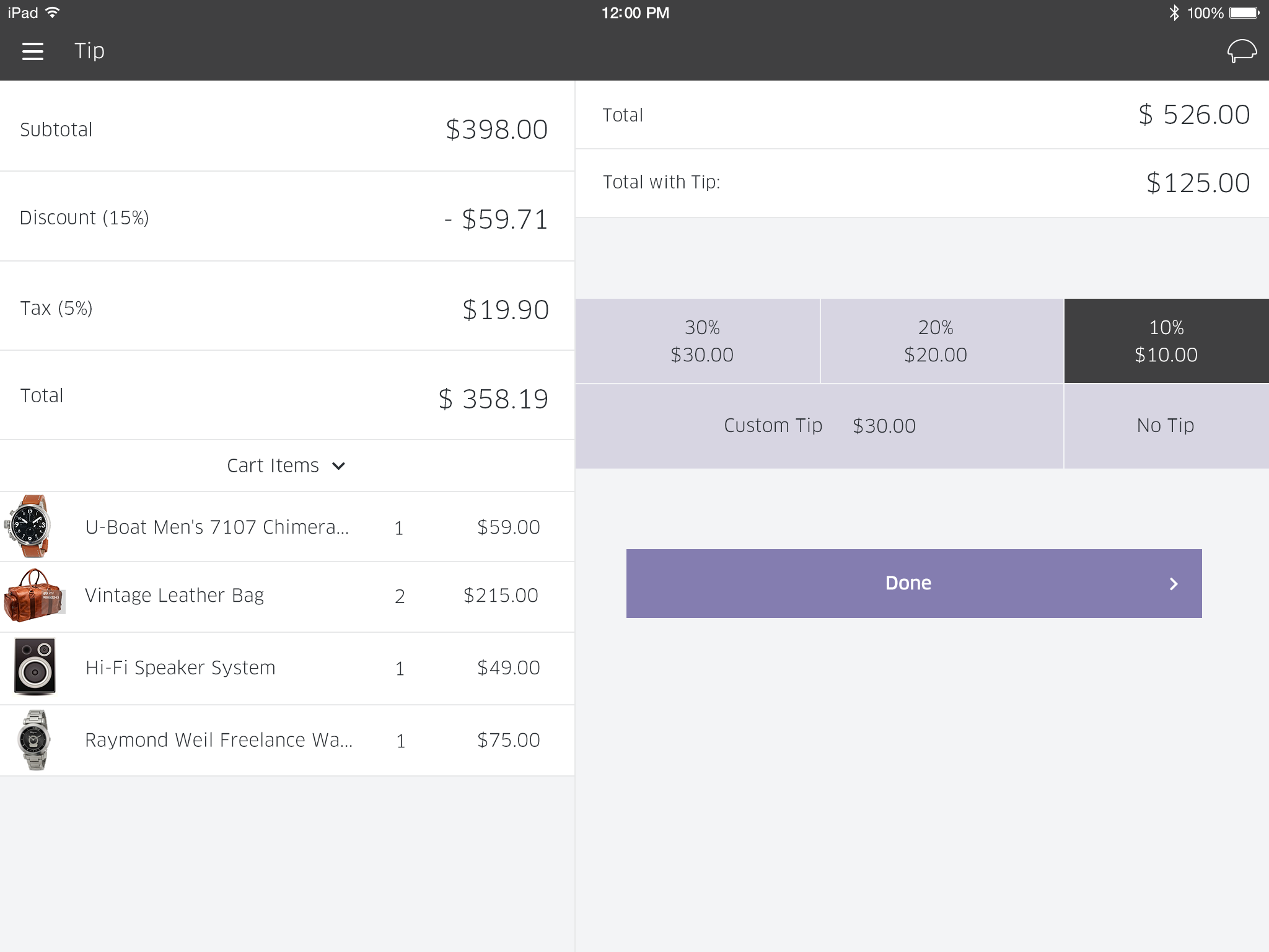
Tip and signature concept on a tablet.
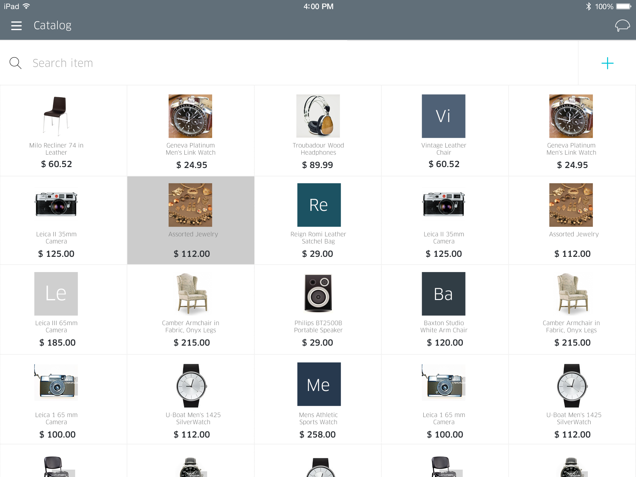
Item catalog concept on a tablet.
Experimental concept of a new transaction flow.
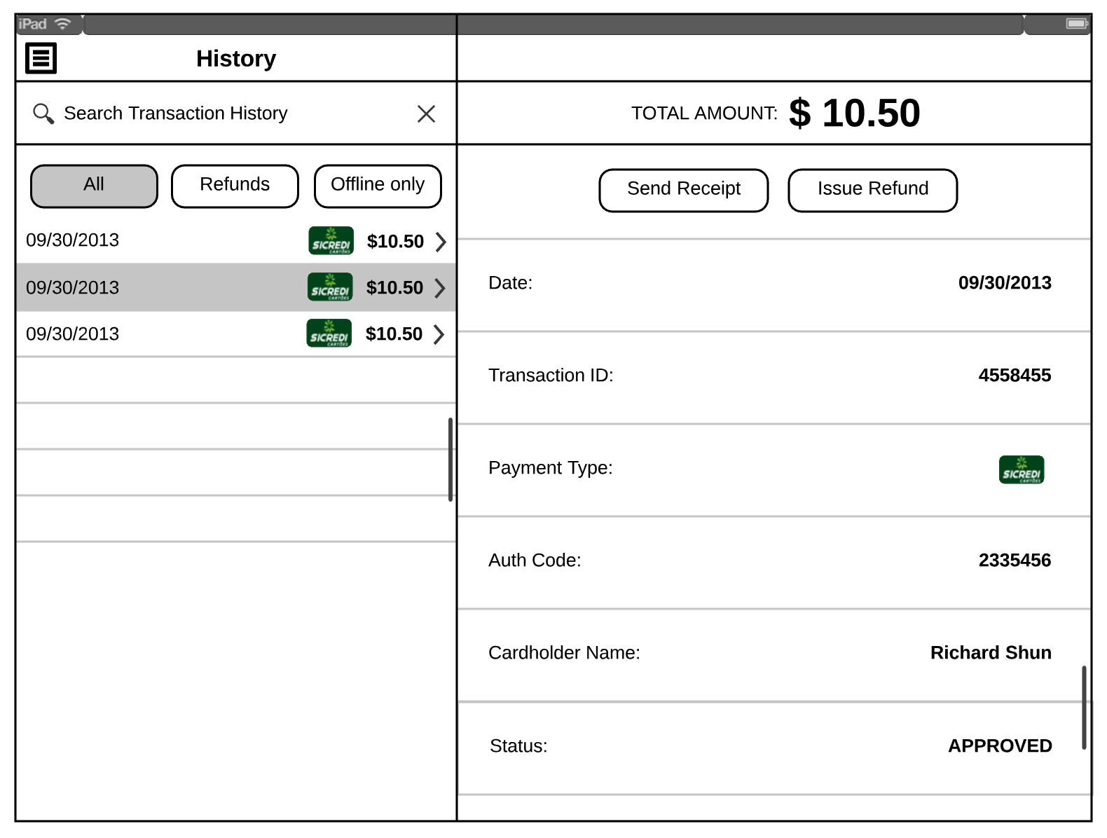
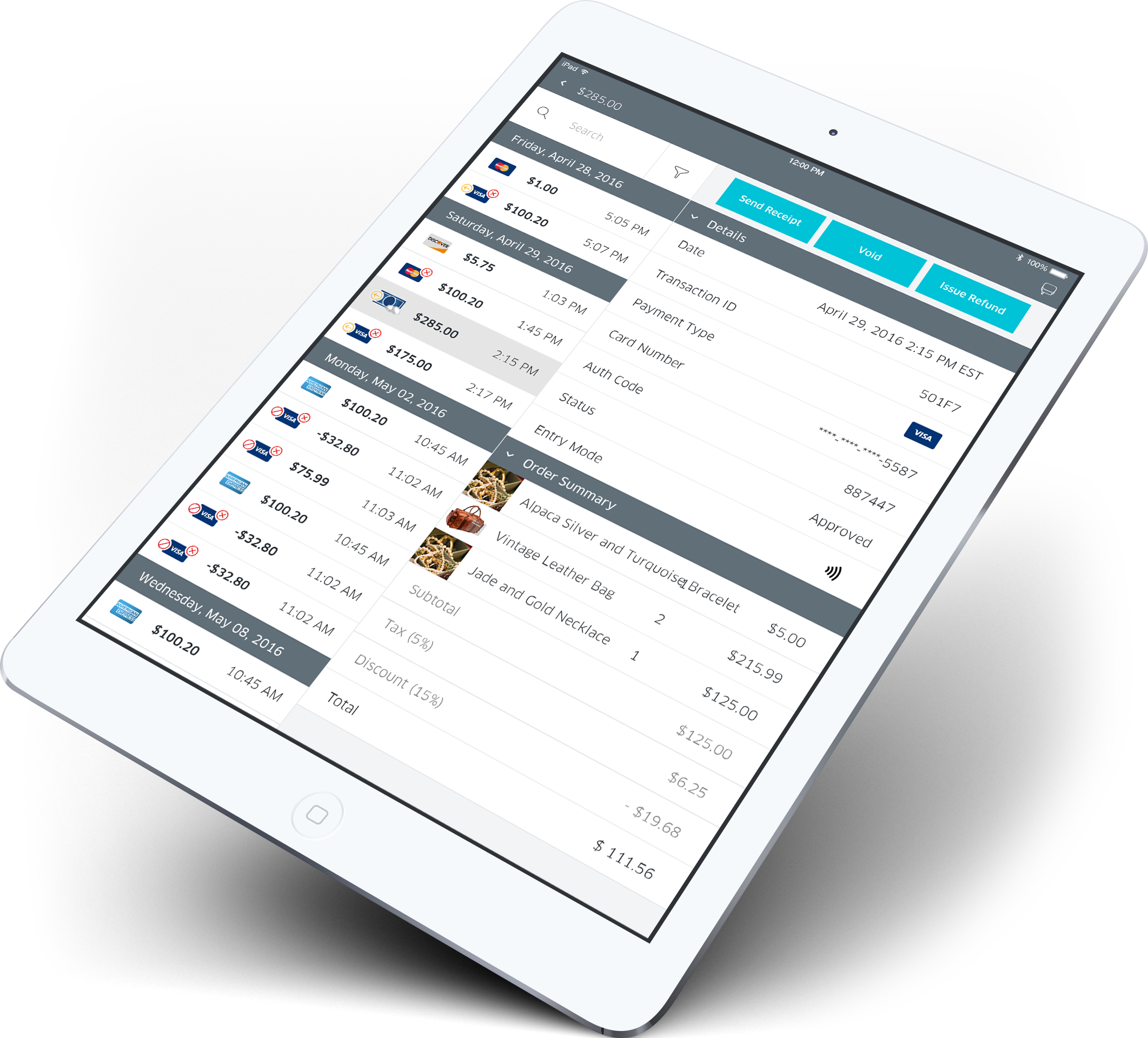
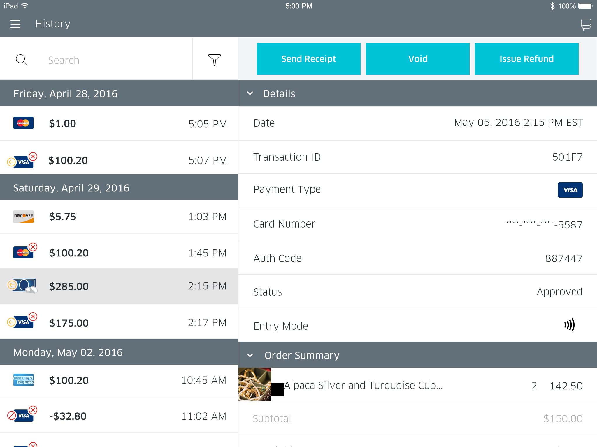
Transaction Details mockup under Transaction History on a tablet.
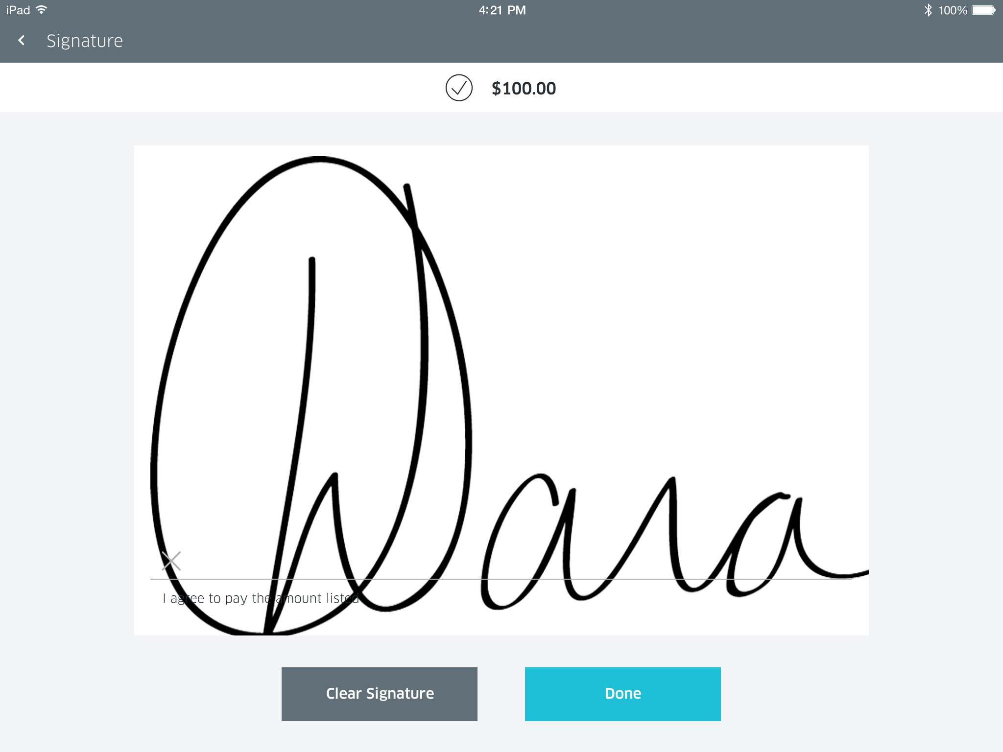
Customer facing signature mockup with a big touch area.
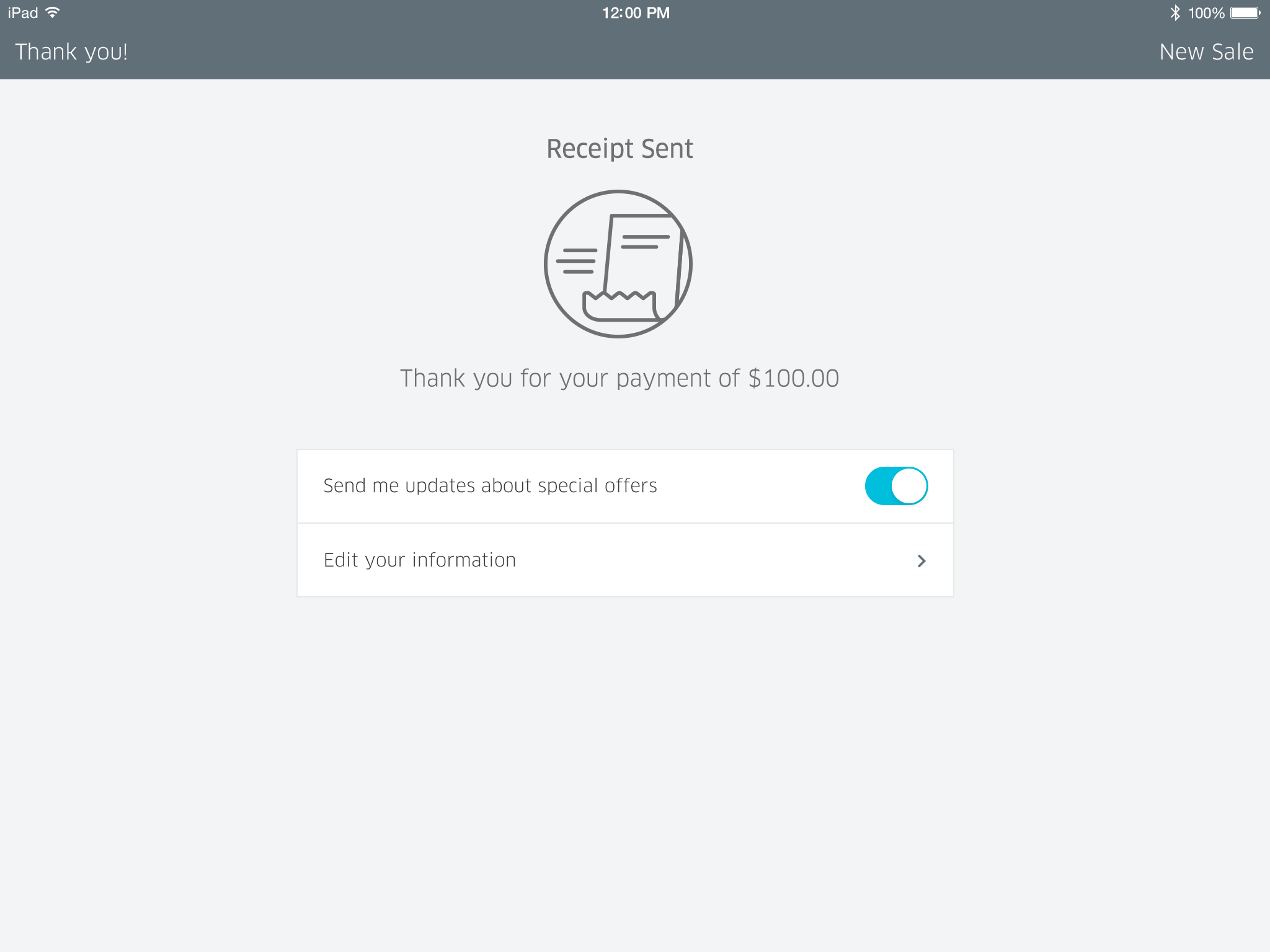
'Thank you' screen at the end of a transaction.
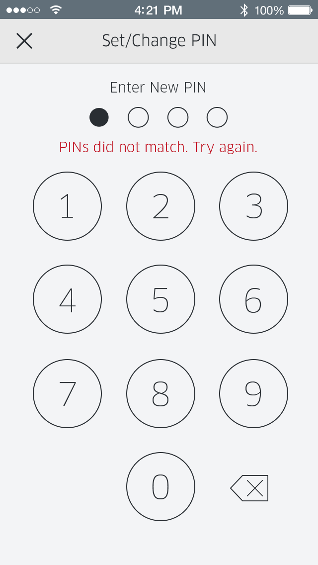
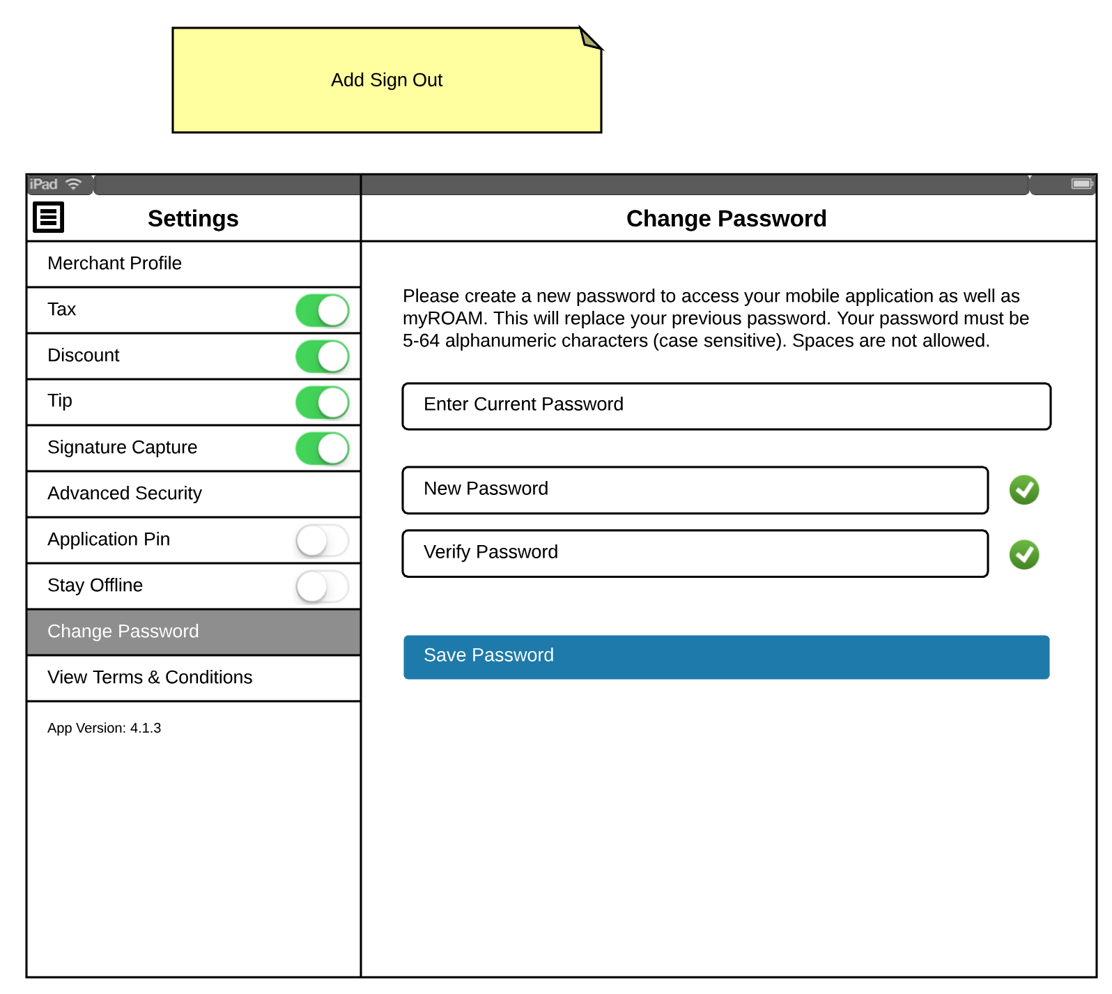
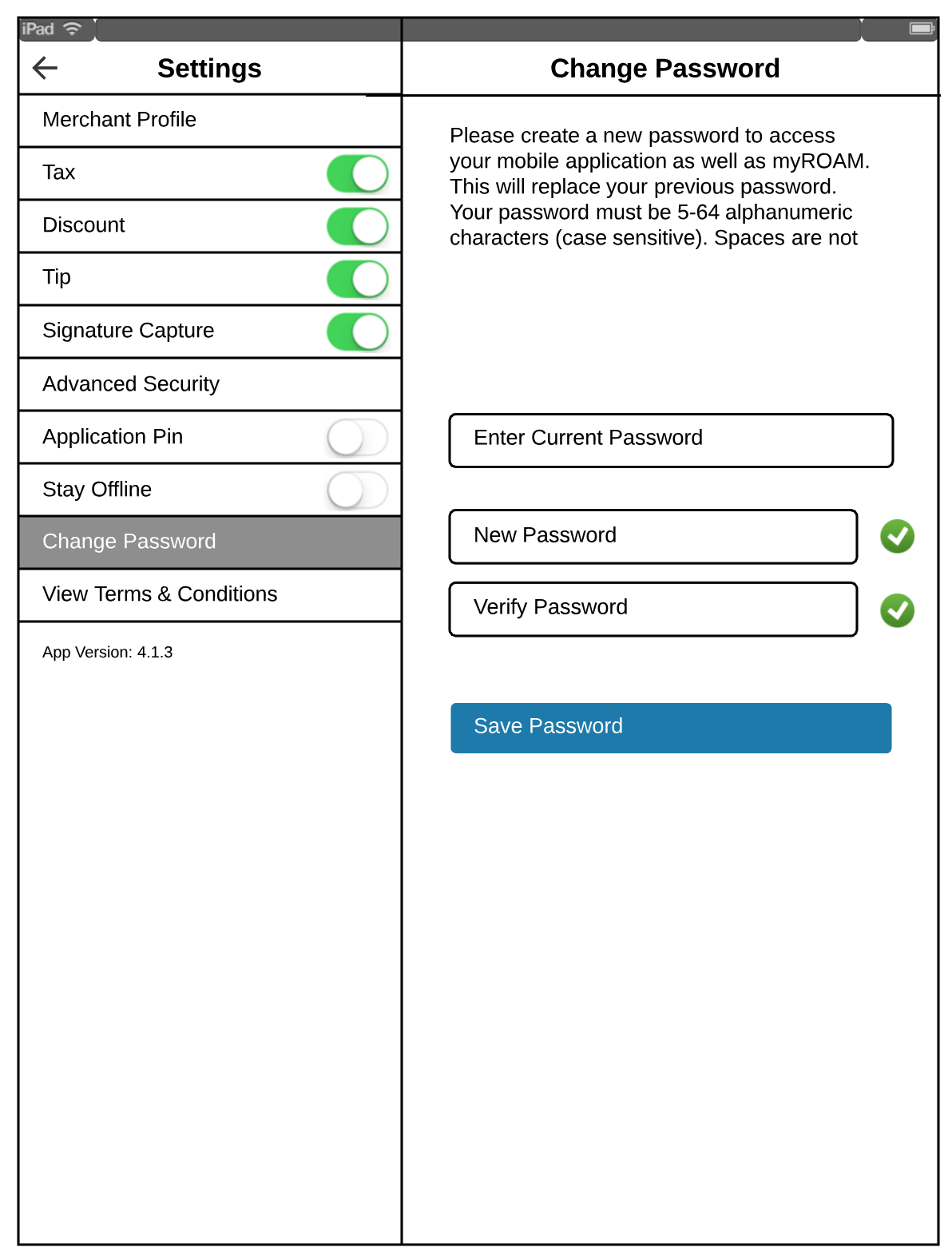
Set/Change PIN concept.
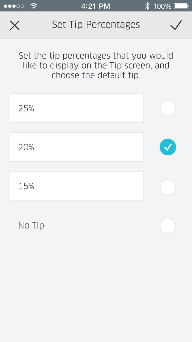
Set default tip percentages.
Concept for a responsive keypad and cart in portrait orientation on a tablet.
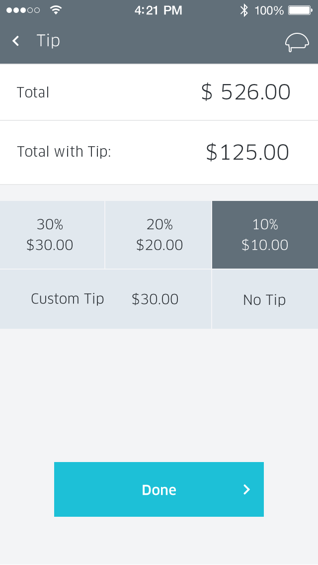
Quickly leave a tip.
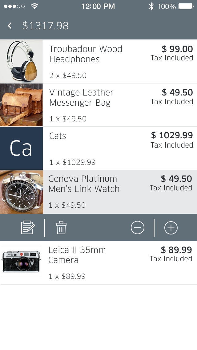
Edit your cart.
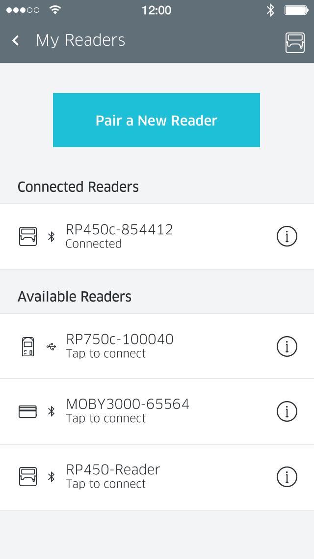
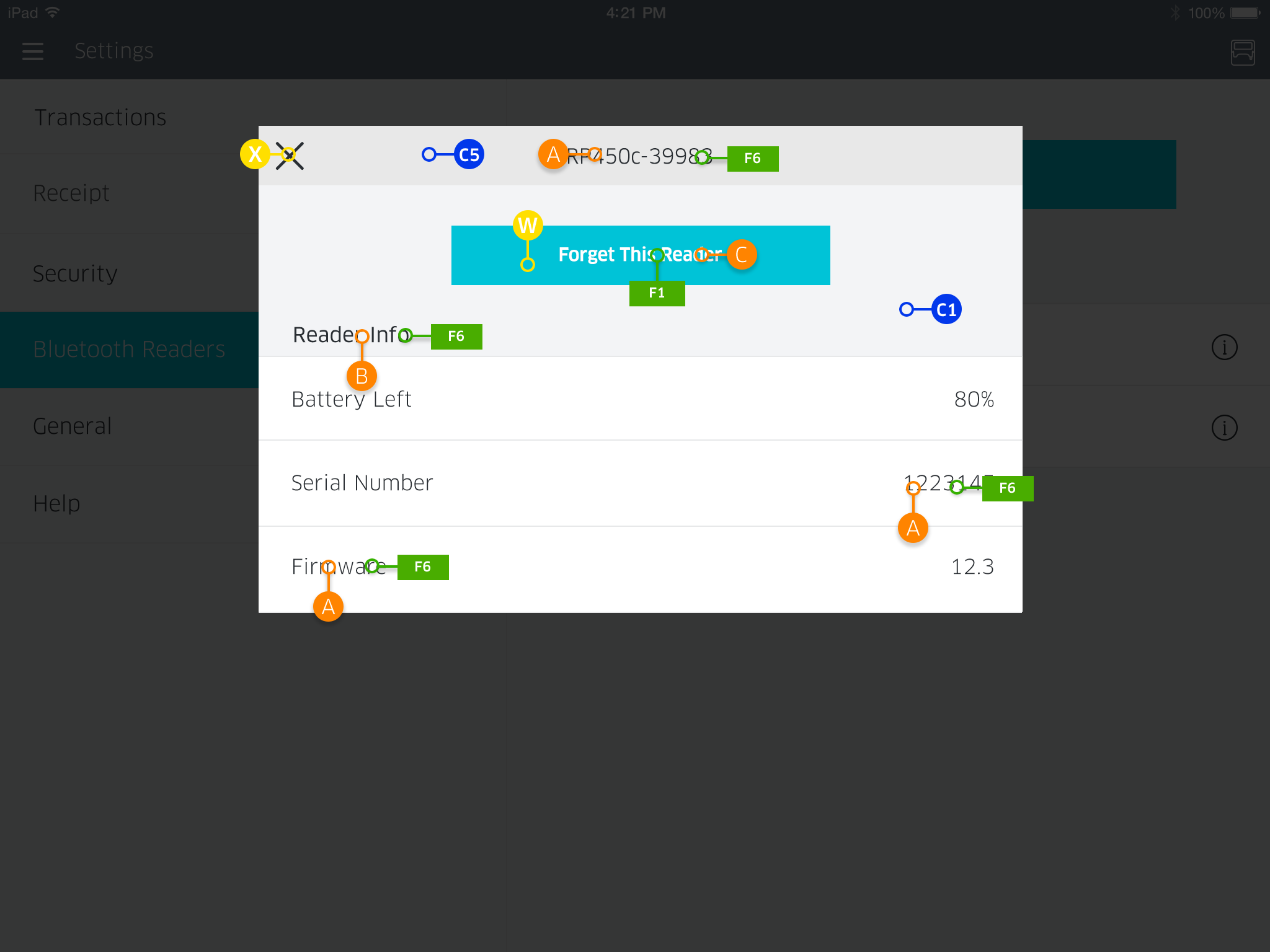
Configure your card readers.
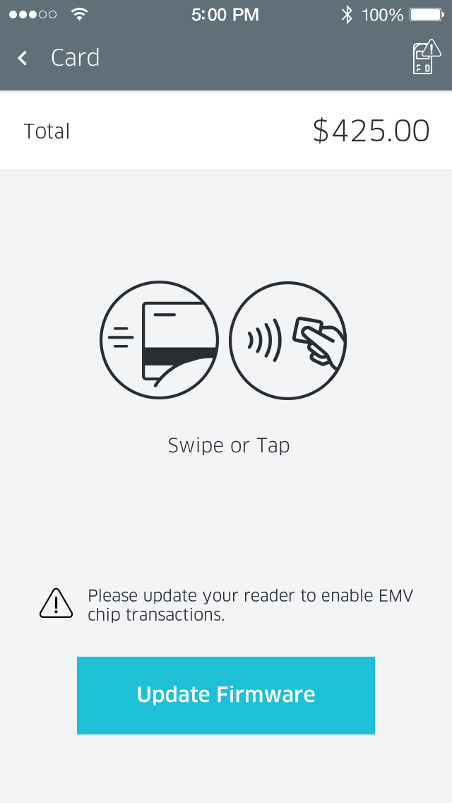
Reminder to update your card reader firmware.
Customer receipt options during checkout.
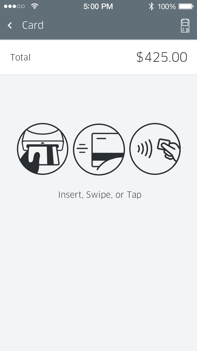
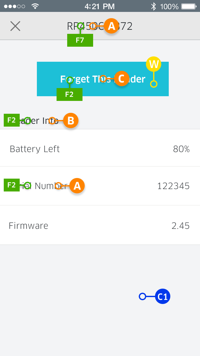
Card reader instructions.
White-Label Solution
One major design goal was to create a brand new white-label process. I wanted to ensure an efficient, easy-to-use process for customers to be able to customize this app using their own brand colors and assets. This meant creating and documenting a process that could be communicated easily between our customers and Ingenico Group’s product, design, and engineering teams.
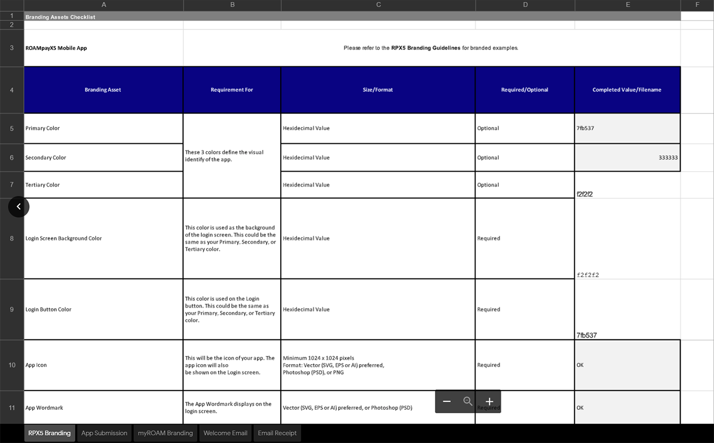
A quick look at the internal RPX5 white-label checklist.
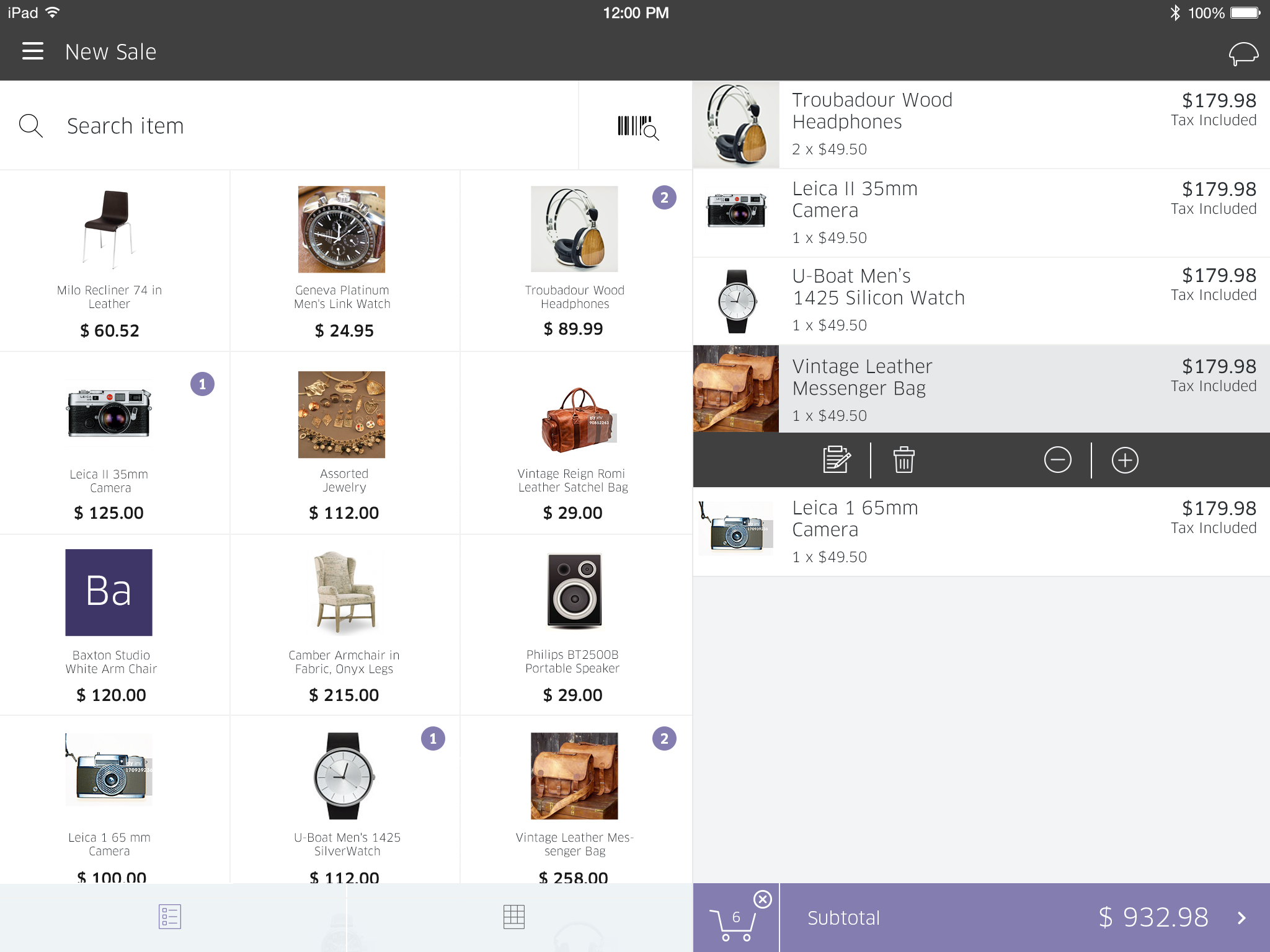
A customer example of ROAMmerchant with our white-label solution applied.
Download my RPX5 customer Branding Guidelines to see the white labeling process.
ROAMpay X5 was a collaborative effort across multiple teams. Working with our developers, I wanted to ensure RPX5 maintained a consistent look and feel across platforms. The designs had to be implemented across both iOS and Android, on both smartphone and tablet platforms, and in multiple orientations.
I worked to create a streamlined process to effortlessly produce and ship graphic assets, colors, and patterns.
The following images are early examples of detailed specifications and callouts regarding UI/UX design patterns. The style details presented here eventually became an internal style guide that included documentation for developers to implement new design components in a speedier, more efficient way.
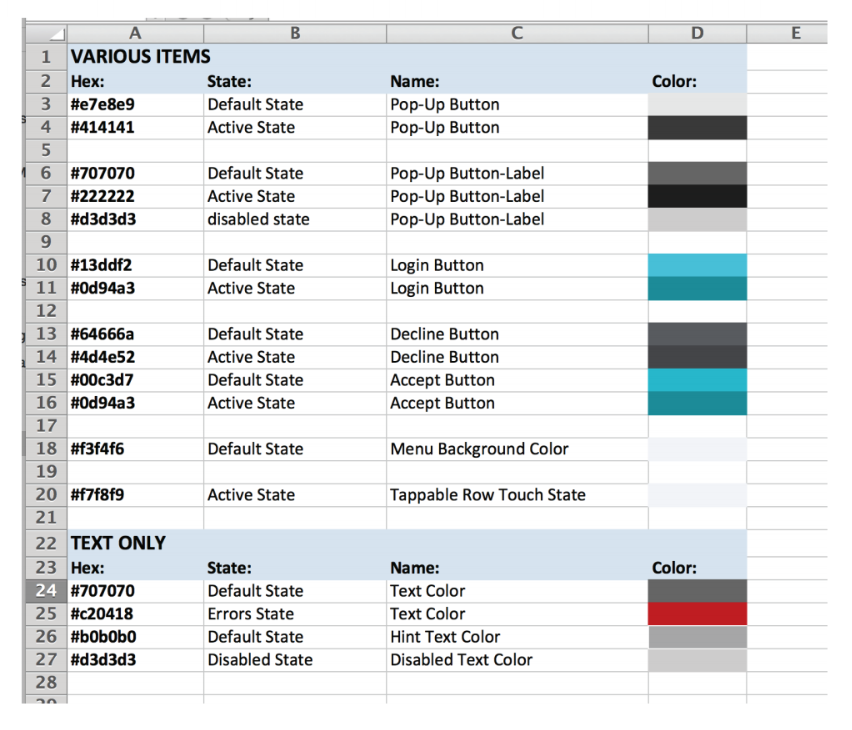
An early look documenting and defining UI styles and colors.
A style guide would further define text styles, colors, and buttons, UI modals, and more.
Early look at defining spacing.
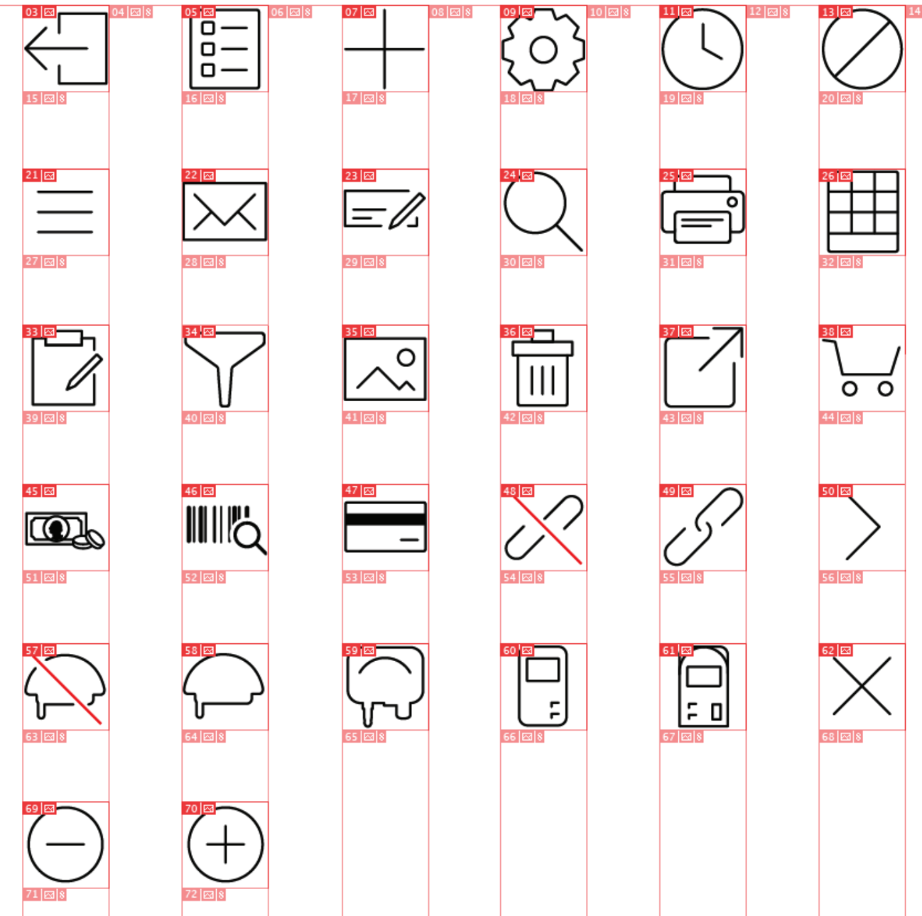
Icon sheet example.
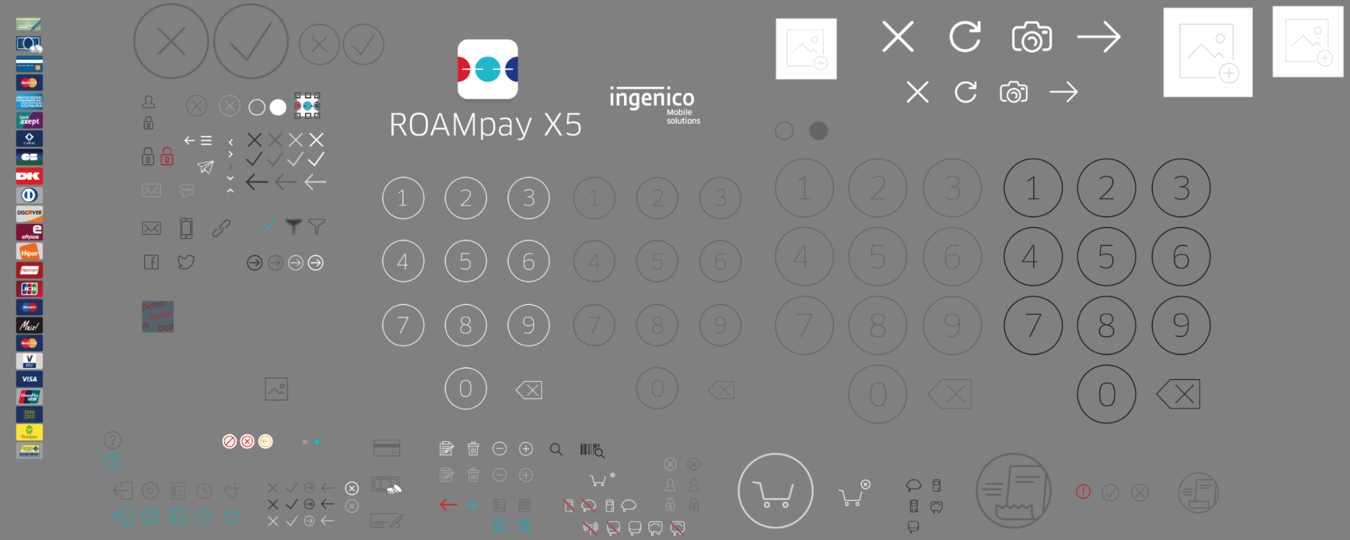
Asset sheet that could easily export deliverables in various resolutions and formats for different platforms.
Summary
Once the new ROAMpay X5 launched, it proved itself to be an immediate success for both Ingenico Group and our hundreds of merchants. With the introduction of a white-label option and a quicker, easier, and more efficient check-out process, we met both user and business goals by providing a creative solution that drives our business forward and satisfies our customers needs.
You can read more about its success via case studies found here.
👍🏻